Skip to content

Selected work

Bactose

A responsive direct-to-consumer wellness storefront that makes a distinctive seven-day monthly probiotic routine easier to discover, understand, compare, and purchase.

Role

Product Designer

Year

2026

Platform

Responsive Web

Category

E-commerce
https://bactose.com
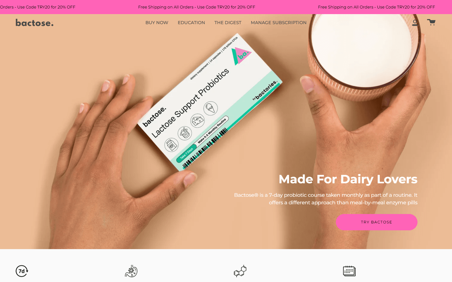
Bactose homepage presenting the seven-day monthly probiotic routine
DiscoveryBenefit-led product introduction and clear entry into the shopping journey.
https://bactose.com
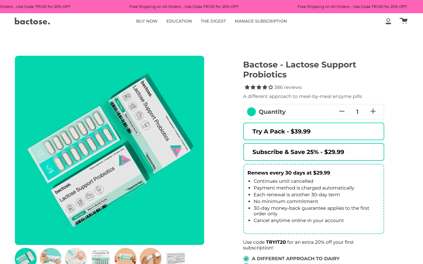
Bactose product page with one-time and subscription purchase options
Product decisionProduct media, pricing, subscription terms, and purchase choices in one view.
https://bactose.com
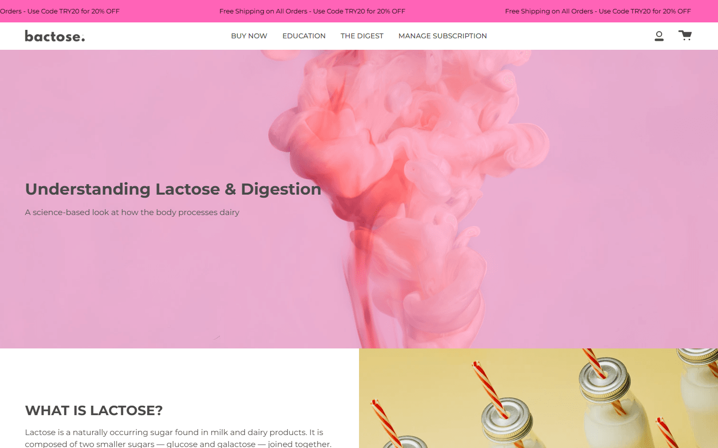
Bactose education page explaining lactose and digestion
EducationScience-led content that supports users who want to understand the product context.

The situation

Bactose introduces a product format many visitors may not immediately recognize: a probiotic course taken for seven consecutive days as part of a monthly routine. The experience therefore has two jobs at once—build understanding and confidence, then support a clear purchase decision.

Product vision

Create a vibrant, credible commerce experience for dairy lovers that leads with a simple benefit, explains the routine in layers, and lets users move naturally between product discovery, science education, one-time purchase, and subscription management without losing context.

Experience strategy

The journey is organized around progressive disclosure. The homepage communicates the routine in seconds through strong imagery and short benefit statements. Product pages bring together media, quantity, pricing, subscription details, guarantees, and supporting facts. Education and editorial content provide deeper explanations for visitors who need more evidence before purchasing.

Visual direction

The visual system combines warm lifestyle photography with a distinctive pink, peach, and teal palette. Large campaign moments create recognition, while neutral content surfaces, consistent spacing, restrained typography, and reusable commerce patterns protect clarity during detailed product evaluation.

Design architecture

01Product StoryA benefit-led narrative that introduces the seven-day monthly routine before asking users to purchase
02Shopping JourneyClear paths from discovery to product detail, purchase choice, cart, and account management
03Subscription UXOne-time purchase and subscription options presented with visible price, renewal, and cancellation details
04Education SystemScience content, FAQs, comparison language, and editorial articles organized for progressive learning
05Trust ArchitectureReviews, guarantees, product facts, dosage guidance, and policy access placed near key decisions
06Responsive CommerceA consistent hierarchy for navigation, product media, pricing, and calls to action across screen sizes

What was hard

Problem

The product follows an unfamiliar seven-day monthly routine, so visitors need to understand the format before they can evaluate it.

Resolution

Structured the experience as progressive education: a concise value proposition first, then routine details, product comparison, science content, and FAQs for users who need more depth.

Problem

One-time purchase and subscription choices can create hesitation when pricing, renewal terms, and cancellation expectations are unclear.

Resolution

Placed both options in one decision area and surfaced price, savings, renewal cadence, commitment, guarantee, and cancellation information alongside the selection.

Problem

The expressive pink, peach, and teal brand system needed to remain energetic without competing with product information on smaller screens.

Resolution

Used strong editorial imagery for discovery, then shifted to restrained white space, repeatable content blocks, and compact interaction patterns during evaluation and purchase.

Design outcome

The resulting experience gives the brand a coherent path from campaign storytelling to purchase. Users can quickly identify the product format, understand how the monthly routine differs from per-meal options, inspect the offer and subscription terms, and continue into educational content when they need more context.

Built with

FigmaProduct DesignE-commerce UXShopifyInformation ArchitectureResponsive DesignConversion DesignContent StrategyInteraction DesignAccessibilityDesign SystemPrototyping

Links